Pages

9/17/2014

Emoticons!

For many people, especially in western cultures, emoticons are silly and thoughtless aspects of cyber-culture. In my research, however, I found that emoticons have developed throughout history and can play a significant role in how we relate to each other in a world of computer-mediated communication (CMC).

Nowadays CMC is vital in the developed world and its importance is quickly growing in developing nations. CMC helps us maintain our relationships both personal and professional; I keep up with friends near and far through email and Facebook. I text message my classmates. I email my clients and professors. I interview over video chat. Regardless of the medium, emotion and its interpretation plays a sizable role in our ability to communicate via computer.

Here is a fun info-graphic I created to decode emoticons :)


8/21/2014

Thesis videos

Towards the end of the spring semester I made some short videos about my thesis.

The videos are along the lines of a public service announcement, and were generally very fun to make; they gave me more experience with Adobe Premiere Pro and Audition, as well.

Take a look...


3/05/2014

Workspace Portrait

Last week in the Thesis Making class with Mary Kate Meyerhoffer we took portraits in our workspace.

We came up with a couple branding words first, then planned out the shot.

I chose to do mine in front of my studio space at CCA because this is where I get most of my work done. It was an interesting assignment and gave me a chance to consider what my workspace says about me and why it looks the way it does.

My branding words are casual (but still thoughtful), brightlayered.

self-portrait in my workspace

I am happy with how the shot turned out, and with my newly clean desk!

3/01/2014

Thesis Meetings: 2/25/14

In this week's thesis meeting Scott and I pretty much just went over the notes from my mid-term crit and discussed my next steps.

Comments from critique:
How do I connect the content of the piece with the content of the explorations?
3D printing and replicas. Be sure I understand the benefits and drawbacks.
What is the artist perspective? Meet with CCA faculty as planned but stay focused on what I'm doing.
Do I want to stick with Cézanne's apples or choose different work depending on the exploration?
How does this happen in the real world?

2/26/2014

Mid-term critiques, done!

Saturday was a long day of mid-term critiques for our class of 2014. The presentations made for a late night on Friday and an anxious Saturday (I didn't present until 2.30pm), but it means we are one milestone closer to graduating! Hooray!

standing next to my presentation material
Listening to feedback post presentation, and smirking, apparently.

For my presentation, I built a phylogenetic tree of sorts representing the different pathways of access I am investigating. (See the matrix of prototypes, discussed in Thesis meetings: 2/14/14)The common ancestor is accessibility, and each of the explorations through which a visitor can interact with or learn about the work fits into one of the four broader categories -- material, visual, dimensional, and historical.

Overall my presentation and critique went well. Plenty to chew on and figure out before the next milestone in March...

2/19/2014

Thesis Meetings: 2/18/14

Most of this week's meeting with Scott was spent discussing my presentation for the critique this Saturday.

Here's a summary:

My shift in perspective is key.
The roots of my current investigation are in the way that people who are blind experience an art museum and how that experience could be improved. Originally, I wanted to create experiences through which people who were blind could access art from different pathways.

But, I realized that access is limited for a lot more people that I originally was considering. I shifted from designing something for a specific user group, to designing something for the general public. By representing works of art through different mediums, people can access them from new perspectives and are bound to see or learn something new.

2/12/2014

Thesis Meetings: 2/11/14

This week I got feedback on my second RP, for now called Pixeled. This prototype, like the previous one, changes vision from a comprehensive process to an additive process, and asks the question, what will we notice when we deliberately slow down our vision?

In Pixeled, the user starts out by choosing a piece of art to look at. An image of the selected work is projected, but it is a distorted version of the user's selected piece. As long as the user is willing to spend the time, the image will slowly reveal itself.

I used Processing for this prototype. After the sketch is opened and a set amount of time passes, a prompt pops up, and the user can "click to reveal," which will decrease the size of the pixels. The sketch is currently set so the user has to go through 12 levels of de-pixelation before they see the clear image, but this is fully adjustable so I can made adjustments as needed!

screenshot of the very pixelated image
Cézanne's Still Life with Apples distorted through 50x50 pixels
screenshot of the pixelated image
A few levels less distorted. The prompt "click to reveal" shows up after a set period of time.

Some clear shapes beginning to form

2/06/2014

Thesis meetings: 2/4/14

A good meeting with Scott this week and my first rapid prototype.

One of the ideas I have been discussing is the difference in the way you see something with touch (additive) and the way you see something with vision (comprehensive). So my first prototype was built to explore this idea: How can you make vision additive?

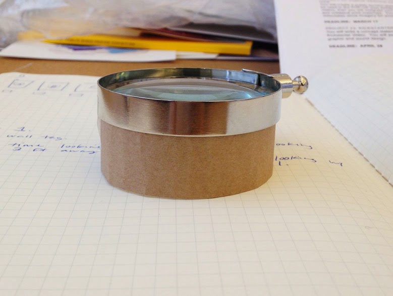
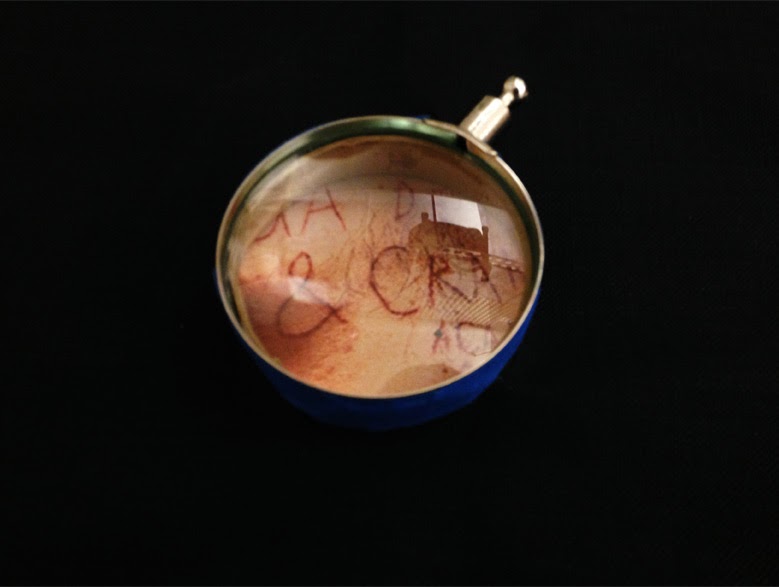
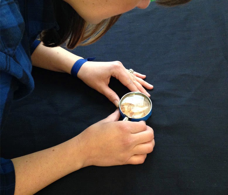
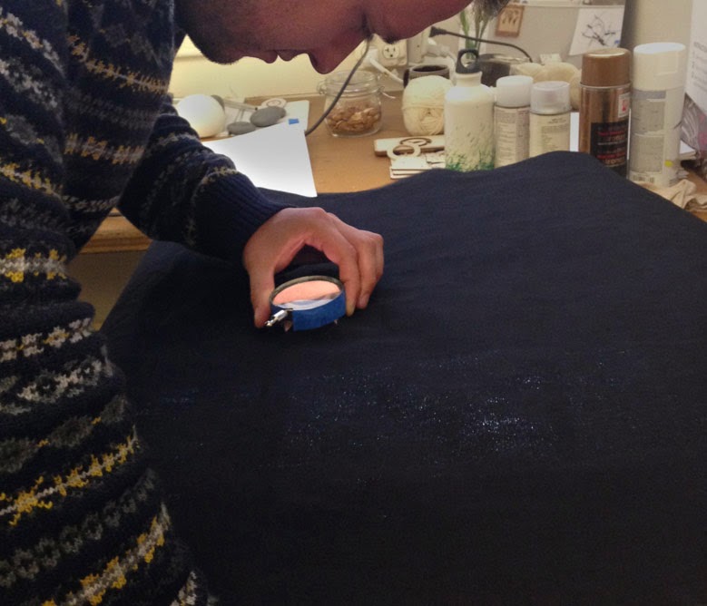
The user sees an image a little bit at a time by looking through a loop which is surrounded by cloth to obscure the rest of the image. The longer they spend, the more they learn about the image. I used a magnifying glass lens as a loop, and secured it into the center of a piece of black canvas which acted as the blind.

loop made of magnifying glass lens and cardboard
I attached a strip of cardboard to raise the lens and increase magnification

Homemade loop surrounded with canvas
Looking through the lens at Poster for the Stefan Sagmeister AIGA Program in Detroit [Text scratched onto the nude body of the designer]


My hypothesis was that generally, people see things and move on. We don't really look close enough to notice the details. But when you have to discover an image bit by bit, you slow down and pay closer attention to details; you learn things you wouldn't learn by seeing the whole composition at once.

I gave participants four images to choose from: Paul Cezanne's Still Life with Apples, an image of Henry Weekes' Bust of Mary Seacole, Georges Seurat's Study for "La Grande Jatte," and Stefan Sagmeister's Poster for the Stefan Sagmeister AIGA Program in Detroit [Text scratched onto the nude body of the designer]. Once the participant selected an image, I placed it on a light table and covered it with the viewing/obscuring tool.

While this exercise was extremely literal, I think it was a good one to do. My classmates enjoyed the process of discovery and most of them pointed out how much they were drawn into the detail.

participant trying the prototype
Jess, exploring a print out of the Sagmeister poster

another participant trying the prototype
Agu, exploring Cezanne's Still Life with Apples. Some participants were chose pieces because they were familiar, some chose pieces because they were unfamiliar.

In attempt to keep myself and my thinking from jumping around like popcorn kernels in a microwave, I spent some time this week making a matrix of prototype ideas which includes description, hypothesis, materials, category, what I am measuring against, and the prototype's conceptual relevance to my project. I hope that by organizing these experiments into the various bodies of information I want to explore ("category," on the spreadsheet), I will be able to explore each body of information more completely.

1/30/2014

Thesis Meetings: 1/28/14

Last week resulted in a lot of reading and reading, and a bit more reading. With my new shift/focussing one of the big to-dos was to define new luminaries and get into the scholarship around multi-sensory exhibits.

As a result, I am adding these four to my list of luminaries.

Amanda Cachia: Curator from Sydney, Australia. Currently completing her PhD in Art History, Theory & Criticism at the UC San Diego. Former student at CCA.1
Madeline Schwartzman: Author of See Yourself Sensing, a survey of artists and designers who explore relationships of the body, technology, and senses.
Georgina Kleege: Teaches creative writing and disability studies at UC Berkeley.
Juhani Pallasmaa: Finnish architect. Author of The Eyes of the Skin – Architecture and the Senses.

Last week I also made my list of CCA faculty I would like to reach out to for a discussion about what they think as artists or curators. So far I have met with one curator, and will reach out to others today.

Here are my discussion questions:
  • What is the societal purpose of an art museum?
  • Are art museums accessible to the general public? Should they be more or less accessible?
  • What is the value of handling objects versus looking at objects?
  • As a curator, how do you decide which stories to tell?
  • As a historian, what do you do when you don't know the answer?
  • In terms of displaying work and telling object stories, what are museums doing right?
  • In terms of displaying work and telling object stories, where are museums falling short?
In terms of multi-sensory exhibits, there have been a number of them done and studies and luckily, the general feeling is that yes, they do indeed increase visitor enjoyment, retention, and understanding of the content of the exhibit. This was something that Scott and I spent a majority of our time discussing. If the multi-sensory museum exhibit is often done and accepted as  good, then why am I focusing on this? 

My work needs to be responding to something, or taking a stance; I need to define the motivation driving my experiments. 
Here is where my luminaries come in. In an article about her experience during a touch tour at MoMA, Georgina Kleege writes that vision is immediate and comprehensive, where as touch is additive and discovery happens a bit at a time.2 This same point also came up during a discussion with my classmate, Tim Carpenter, and this is one of my driving forces. What would happen if vision were not comprehensive and immediate? A new way of seeing could make you slow down, notice new details, and come up with new questions. How might I make an experience that invites users to view art in an additive way?

Kleege also makes a point that "since everyone does not get to touch the art, as much as they might want to, there is a value in hearing what we—the privileged few—have to say about it.”3 This also feels like potential to become a driving force but I need to think on it for longer.

What else are my driving forces? Scott and I discussed a few options which sounded like there was potential. What does it mean to really experience something from a historical perspective? What about material or process immersion?

What is the experience I want people to walk away with? 
So far my language has been about seeing objects anew, in stages or layers, and finding nuance. I don't want my experiences to feel forced or contrived. This experience, like all museum experiences, should to be enticing. I also don't want to overwhelm people with views. I want increase access by means of creative multi-sensory views, but Scott cautioned against offering so many views that the visitor feels there is nothing left to discover.

What happens when I inevitably cannot display a masterpiece in the design MFA exhibition?
1) Too early to worry about this.
2) There is also the philosophical case to be made that the masterpieces we see today aren't the "original" anyway. There are countless mediation factors; the obvious factors (lighting, glass, museum crowds, velvet ropes) and the less obvious factors (discoloration, canvas modification, restoration, curator and museum perspective, forgeries).

With this in mind, perhaps there really is no genuine experience, in which case it doesn't matter whether the "original" is present. It is a big, bold point to make, but I like it.

To do
Start a running list of all the multi-sensory art exhibitions and related studies
Look into the Pilara Foundation Collection at the photography museum at Pier 24 in relation to the no genuine experience concept.
Come up with +/- six  "driving forces"
Contact more curators and artists
Finish my work plan and keep working


1. Cachia, Amanda. “Talking Blind: Disability, Access, and the Discursive Turn.” Disability Studies Quarterly 33.3 (2013): n. pag. Web. 23 Jan. 2013.
2. Kleege, Georgina. "Some Touching Thoughts and Wishful Thinking" Disability Studies Quarterly 33.3 (2013): n. pag. Web. 6 Oct. 2013.
3. Ibid.

1/27/2014

Thesis meetings: 1/21/14

The new semester is here (gulp) along with a narrowing and slight shift in my thesis direction.

In the most concise explanation, I am exploring visual art beyond the visual.

Basically, I mean that I am looking at the meaning of accessibility in art museums and using tactile and multi-sensory experiments to amplify and expose non-visual information. I want to create probes that explore tangible elements such as scale, weight, materiality, and less tangible elements such as process, and context.

Here are the notes from my first meeting with adviser Scott Minneman.

I could make the case that a lot of visual art is "inaccessible." 
Art on a wall of a museum, perhaps, is just a statement. Contextualization and interpretation is very limited.
What about audio tours and docents? Those are great! But they take planning and/or extra money; docents aren't always available and both audio tour and docent tour usually cost extra. With most audio tours, there is little room for interpretation.

Your original thesis topic was to improve the museum experience for visitors who are blind. What happened?
What I learned from my conversations and museum experiences with people who are blind is still guiding my direction. However, I realized that I wanted to look at "accessibility" in a broader sense. Rather than make a tool for one user group, I want to make a tool that will increase accessibility for anyone who uses it. Museum visitors who are blind are still an important user group for me, but are no longer the only user group.

Are multi-sensory art exhibits too extreme/unrealistic/impractical?
Well, museum are already weird and extreme. For example, historical pieces that were never meant to be seen in white walled rooms are seen in white walled rooms. Museums could be thought of as a particular historical "accident."
In the words of Thomas Thwaites from The Toaster Project*, "there’s not much point in imagining futures that are the same as the present. For one, it’s not very interesting, but it’s also not very useful, and can be dangerous" (176).
So there.

When a piece is sold, the owner gets to touch it as much as s/he wants.
But in public institutions, obviously this can't be done.

What do artists think? What stories, if any, do they want told?
Also, what do curators and historians thing? What do they want told? A multi-sensory exhibit also opens the door for a multi-story exhibit. It will vary from person to person, but I need to get some data points in terms of what artists and historians think about multiple object perspectives.

To do
Come up with new luminaries
Read scholarship around multi-sensory exhibits
Contact curators and artists to learn about sacred cows
Look at the Gardener museum in Boston
Read up on current language of Universal Design
Watch Understanding Art: Hidden Lives of Masterpieces

To answer
What are my guiding principles?
How do I qualify successful experiments?
Who am I in service of?
Whose story am I telling and will it be historically accurate?
How do curators deal with unanswered questions?


* Based on Thwaites's MFA design thesis project, very, very, very inspired and inspiring.

11/03/2013

Explorations in Perception

I started reading See Yourself Sensing: Redefining Human Perception by Madeline Schwartzman, and boy, is it a trip. The book is a survey of projects and works that explore human perception, senses, and the body. The projects are visceral, often disturbing, provoking, and thoughtfully curated.


The cover image of See Yourself Sensing
Hyungkoo Lee, The Objectuals
Image of a person being shot with flames in Hobijn's self-immolation machine
Erik Hobijn and self-immolation
Image of Lawrence Malstaf suspended and shrink wrapped in a sheet of plastic
Lawrence Malstaf, Shrink

10/21/2013

Thesis: manifesto-ish

It's about time I update this with my thesis work so far. I won't lie, I've had some hiccups. Or, perhaps, I have some hiccups.

The Hardest Part: A I have had difficulty in wrenching my head out of the theory and the research to just do. There are so many rabbit holes to peer into -- which I do not think is all bad. The Hardest Part: B I am having trouble connecting with people who are blind. I have been reaching out to groups left and right, but understandably so, it's been difficult. I imagine that many people who are blind receive numerous calls or emails from students wanting to involve them in a project, and I am sure this is tiresome to say the least. I hope, however, that my project is one that truly makes people think about human perception, the meaning of experience, story, and culture. Plus, I think that involvement will be interesting and fun for participants, hell, it might even make a real difference. I have started to make some progress through Lighthouse for the Blind in SF and possibly with a student group, so fingers crossed.

Post midterm review I have taken the critiques to heart and I am trying to write a manifesto of sorts which I hope will keep me focussed. Here is the working document.

When sighted visitors go to a museum they have many options in terms of how they shape their experience (fast, slow, deep, shallow, permanent collection, special show). Blind museum visitors, however, have far fewer options. Most museums offer special accessibility tours once a month, but these tours often fill up weeks in advance and are scheduled during the work day. My hypothesis is that these top down experiences, while valuable, do not meet the needs of most blind visitors. I am exploring ways improve the museum experience for blind or low vision visitors by pushing on the content and creating multi-faceted object stories that go beyond what is expected in order to create rich experiences through our non-visual senses.

I am doing this because I think museums are unique and special and because I think they should be designed for everyone who is interested. (And on a tangent, I think they are in danger of becoming more known for their Thursday evening parties than for their collections if they are not willing to change and embrace technology). The theories of universal design tell us that when you improve a design for the edge users, the experience will improve for all users. When I first learned about universal design I was struck by the story of the OXO brand. I know, I know, the OXO example is tired and overused, but it resonates with me. I have rheumatoid arthritis, and I can assure you that there are many “simple” actions that are nearly impossible for me to perform. I constantly make adaptations to accommodate limited mobility in my wrists and for the most part things are manageable. But regardless of how many times I have heard the OXO story in my years as a design student, I love it. It is pretty, pretty, pretty, pretty good that design can be used to make such a difference in our lives. I have experience adapting products to fit my own unique needs, and I enjoy learning about the myriad of ways that other people adapt products or situations to fit their unique needs. We are so accustomed to products and experiences that are not designed to meet our needs that we go through the modification without any thought to design as a practice. 

My specific interest in museum visitors who are blind was sparked by a slender, gem of a book I found in one of the libraries at the Cooper-Hewitt, National Design Museum. The book, Finding the way by ear, hand and foot, was written by the Danish Design Center and describes the development process of creating better tools and surroundings for persons who are blind or partially sighted. As the book's back flap says, “tools developed for a particular user group become better tools, not just for those users, but for everybody.” From there, Katie Shelly and I started to think about what the experience would be for blind visitors at the Cooper-Hewitt when it opens in October 2014. We started by doing a competitive survey of the museum experiences for blind people at a number of different museums in New York City....

to be continued.

I end this post with a really nice screenshot of Antarctica via Google Street View.

screen capture from google maps street view, antarctica


10/16/2013

Consonance

This is a project I made for Christopher Willits' Sound and Image Resonance class. The intent of this exercise was to explore how sound shapes and changes our understanding and expectations of visual elements.

All GIF credit goes to Matthew DiVito of mrdiv.tumblr.com. 

Best with headphones!


9/22/2013

Thesis beginnings

Thesis R&D is in full swing. After some research in museum accessibility over the summer at the Cooper-Hewitt, National Design Museum in NYC, I've decided to focus my thesis investigations on the the museum experience for blind and low vision visitors.

There are still a lot of things I need to get my brain around...

Am I more interested in improving museum experiences, or improving an experience for a blind or low vision person?

Well, neither strictly.

I think what I'm most interested in (at least today) is in how people see things differently and how one sense can be translated to another.

People who are blind because they experience the world in a different way. Museums because they are where all this stuff is collected and where people have dedicated and focussed moments.

There are a few of tools out there, like Touch Graphic's Talking Tactile Exhibit Panels that narrate an object according to where you are touching it. Pretty awesome. But, the content is all tell and no show.


Since I am still in the testing the waters phase, I think I'll spend some time exploring unexpected ways that visuals can be expressed. What does a painting feel like? What does a painting sound like? How can we translate visual art in an way that creates rich experiences for experience all of the senses?


7/20/2013

Pizza and museums

Last week I enjoyed a delicious pizza and a great chat about museums with Cara McCarty, Cooper-Hewitt's Curatorial Director.

We shared a pizza at Gina La Fornarnia on the upper east side. The restaurant itself is pretty garish with Pepto Bismol pink awnings, chairs, and walls but once you get past the decor the pizza is fantastic. Cara and I had the fresh fig and prosciutto pizza; it was a combination of salty and sweet -- extra thinly sliced prosciutto and figs baked to the point of caramelization. The crust was tasty but the clincher was the sauce -- a delicious cream of parmigiano. Aww yesss.

Over lunch, Cara shared with me some thoughts about what it is to work in a museum and how things have changed since she started out in the 1980's. As she sees it, there have been three major changes that have shaped the industry -- blockbusters, computers, technology. 

7/16/2013

Object of the Day

Object of the Day is a daily blog by the Cooper-Hewitt National Design Museum aimed to help you discover a different object from the collection every day.

I did a post as part of my summer internship, which you can see on the website here, or read below.

Collection Connections


As a new member of the Digital + Emerging Media team here at the Cooper-Hewitt, I've been spending a lot of time learning about our various projects in process. One of the most enthralling resources I've encountered so far is the collections database. Try it out, if you haven't already; you'll see why it's so satisfying to explore. Here's an example. I started browsing with the "random" link and it brought me to this collage for a textile by one Alexander Hayden Girard.


Ok, so the collections database has lots of pretty pictures...but so what? Well, the great thing about the collections database is that it exposes relationships and allows you to make connections. Rather than seeing the Girard collage as an isolated object, I can see it in a variety of contexts. For example, if I click on "Alexander Hayden Girard," I am taken to a page that gives me information not only about Girard, but also people and organizations he has collaborated with and other objects he is connected to. Here is where it gets interesting. I can see the collage in context by viewing it alongside the other objects designed by Girard within the collection, and I can start to answer questions like "is this piece typical of Girard's style and work?"

Or, instead of looking at other objects designed by Girard, I can take a broader view by clicking on the link in the Period field. In the case of Girard's "Design for Textile-Quatrefoil," the period is Postwar. Here I can begin to understand what else was going on in the world of design when Girard made this piece.

I see a lot of objects in the postwar period were designed by Tommi Parzinger, who is he? Repeat, repeat, repeat… No man is an island, and no design is created in a vacuum. The collections database has a long way to go but it is making huge steps towards revealing context and connections between the objects in our collection.

7/03/2013

visual icons for interactivity

My co-worker, Aaron Straup Cope, reminded me about the work of Timo Arnall today. Arnall's work on graphic language for touch resonated and inspired me to sketch out some graphic language ideas of my own.

Talking / Connecting

Let's see if I can keep it up.

6/07/2013

democratization of design

A classmate showed me The Noun Project.

I love it. You can search for any noun and find its corresponding icon, all free to use (with attribution) or under the creative commons license.

 Thesis in the field of democratization of design?? It's worth exploring.

5/20/2013

[IxD Studio] The Water Project

The last project in IxD studio was to envision the future of water and to share that vision.

My group (Shaili Das, Ramune Rastonis, and Vida Riahi) decided to look at the future of the oceans. We wanted to create a space that would cause people to consider the way their choices impact the environment, without being judgmental or preachy.

'Oceans' is a pretty vast subject; given the scope of the project, we needed to keep a narrow our focus and create something simple. We wanted to create a sensory space where people could take a minute to sit, contemplate, relax, escape, and be mesmerized. Our inspirations were, not surprisingly, mostly aquariums.


5/10/2013

[IxD Theory] Reflections

Reflect on how this course has affected your perspective as a designer. What has changed? What has stayed the same? In what ways are you more confident and what gaps do you still feel you have?
Hi Arna,

Thank you. Interaction theory has been one of my favorite courses this first year in the grad design program at CCA; it has been instrumental in helping me define where I want to go and why I came back to school in the first place.